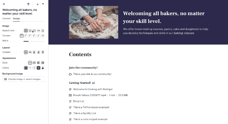
Customize the look of your site with new settings for:
aspect ratio (images)
corner styles (images and videos)
width (image and videos)
These settings will apply to all images in a particular section — great for getting a consistent look right from the Podia website builder. The design options are available on any website page sections that can have images, including the header and footer.
This also means you have more control over how your website logo looks! We switched up the logo size limits (now, 50% of the header width, instead of a 50px height), so you have more real estate in the header to showcase your brand.
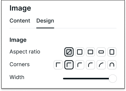
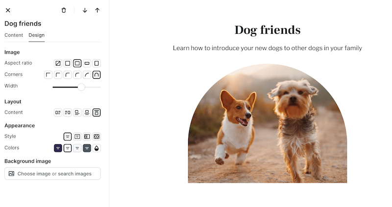
Aspect ratio The aspect ratio of an image determines its proportions, or the relationship of width versus height.
Choose between five different aspect ratio options for your images:
natural (reflecting your original file)
square (1:1)
landscape (4:3)
wide (16:9)
portrait (3:4)
Corners You can adjust the roundedness of the corners on an image or video with six different options, ranging from a straight 90-degree angle to a fully-rounded angle, as well as an arch shape.
Width Adjust the width of your images and videos to what looks best, given your Content Layout and Appearance settings. For left- and right-aligned media,
you can set the width up to 60% of the page section.
A few notes before we go
Some of the new image and video design options won't be available for certain stylized layouts in the Bio section.
We've also added a new Header design layout. If you'd like a minimal look, choose the "Mobile" layout option to condense all your links into a hamburger menu.
These new design options, in addition to the website builder's layout and appearance settings, provide so many potential customizations for your website design. We hope you have fun exploring new looks for your site!
This email was sent to [email protected]. To make sure you keep getting these emails, please add us to your address book or whitelist us. Want out of the loop?
Click here to manage your subscription or here to unsubscribe.
Our postal address is: Podia Labs, PO Box 4668, PMB 96490, New York, NY 10163, United States
