| From | Eve Tahmincioglu, Economic Policy Institute <[email protected]> |
| Subject | Top 5 Countdown -- Chart #1: This chart says it all |
| Date | October 30, 2020 1:33 PM |
Links have been removed from this email. Learn more in the FAQ.
Links have been removed from this email. Learn more in the FAQ.
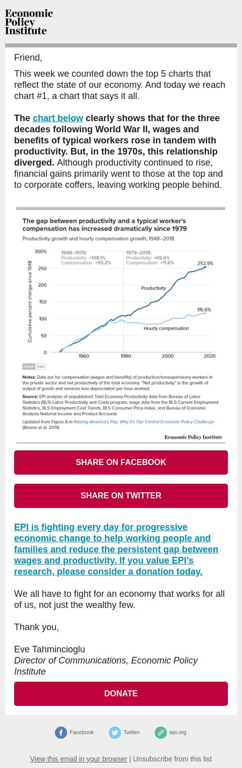
Following World War II, wages rose with productivity. But that stopped in the 1970s.
[link removed]
Friend,
This week we counted down the top 5 charts that reflect the state of our economy. And today we reach chart #1, a chart that says it all.
The chart below ([link removed]) clearly shows that for the three decades following World War II, wages and benefits of typical workers rose in tandem with productivity. But, in the 1970s, this relationship diverged. Although productivity continued to rise, financial gains primarily went to those at the top and to corporate coffers, leaving working people behind.
[link removed]
SHARE ON FACEBOOK
([link removed]
tion%3Dopener%26frame%3Dfa604b2ffd17c8%26result%3D%2522xxRESULTTOKENxx%2522&picture=https%3A%2F%2Ffiles.epi.org%2Fcharts%2Fimg%2F172791-21692-email.png&sdk=joey&version=v5.0)
SHARE ON TWITTER ([link removed])
EPI is fighting every day for progressive economic change to help working people and families and reduce the persistent gap between wages and productivity. If you value EPI’s research, please consider a donation today. ([link removed])
We all have to fight for an economy that works for all of us, not just the wealthy few.
Thank you,
Eve Tahmincioglu
Director of Communications, Economic Policy Institute
DONATE ([link removed])
============================================================
** Facebook ([link removed])
** Facebook ([link removed])
** Twitter ([link removed])
** Twitter ([link removed])
** epi.org ([link removed])
** epi.org ([link removed])
** View this email in your browser ([link removed])
| ** Unsubscribe from this list ([link removed])
[link removed]
Friend,
This week we counted down the top 5 charts that reflect the state of our economy. And today we reach chart #1, a chart that says it all.
The chart below ([link removed]) clearly shows that for the three decades following World War II, wages and benefits of typical workers rose in tandem with productivity. But, in the 1970s, this relationship diverged. Although productivity continued to rise, financial gains primarily went to those at the top and to corporate coffers, leaving working people behind.
[link removed]
SHARE ON FACEBOOK
([link removed]
tion%3Dopener%26frame%3Dfa604b2ffd17c8%26result%3D%2522xxRESULTTOKENxx%2522&picture=https%3A%2F%2Ffiles.epi.org%2Fcharts%2Fimg%2F172791-21692-email.png&sdk=joey&version=v5.0)
SHARE ON TWITTER ([link removed])
EPI is fighting every day for progressive economic change to help working people and families and reduce the persistent gap between wages and productivity. If you value EPI’s research, please consider a donation today. ([link removed])
We all have to fight for an economy that works for all of us, not just the wealthy few.
Thank you,
Eve Tahmincioglu
Director of Communications, Economic Policy Institute
DONATE ([link removed])
============================================================
** Facebook ([link removed])
** Facebook ([link removed])
** Twitter ([link removed])
** Twitter ([link removed])
** epi.org ([link removed])
** epi.org ([link removed])
** View this email in your browser ([link removed])
| ** Unsubscribe from this list ([link removed])
Message Analysis
- Sender: Economic Policy Institute
- Political Party: n/a
- Country: United States
- State/Locality: n/a
- Office: n/a
-
Email Providers:
- MailChimp